Design a Homepage That Explains Your Business in 5 Seconds
You’ve got five seconds.
That’s it. That’s all the time you have to convince a visitor that your website is worth their attention. Five seconds before they hit the back button and move on to your competitor. Five seconds before they decide you’re either the solution to their problem or just another confusing website cluttering up the internet.
And here’s the brutal truth: most homepages fail this test spectacularly.
They’re packed with industry jargon, vague mission statements, and enough navigation options to make a visitor’s head spin. The business owner knows what they do, but the visitor? They’re lost before they even scroll.
If you’re a solopreneur or small business owner, your homepage isn’t just a digital business card. It’s your hardest-working salesperson. It never sleeps, never takes a vacation, and works 24/7 to turn strangers into customers. But only if you design it right.
The good news? You don’t need a fancy agency or a five-figure budget to create a homepage that works. You just need to understand what website design principles actually matter and how to apply them without overthinking it.
Let’s strip away the noise and get straight to what works.
Key Takeaways
- Clarity beats cleverness every time – Your homepage must communicate what you do, who it’s for, and why it matters in five seconds or less
- The five-second test is real – Visitors make snap judgments about your credibility and relevance faster than you think
- Simplicity drives conversions – Less is more when it comes to homepage messaging, navigation, and calls-to-action
- Mobile-first isn’t optional – With 1 in 5 smartphone users making purchases on their mobile phones, your homepage must work flawlessly on small screens
- Action-oriented design wins – Every element should guide visitors toward one clear next step
Why Your Homepage Probably Fails the Five-Second Test
Let’s start with a reality check.
Pull up your homepage right now. Set a timer for five seconds. Look at it. Now close your eyes.
Can you answer these three questions?
- What does this business actually do?
- Who is it for?
- What should I do next?
If you hesitated on any of those, your visitors are doing worse. They don’t have your insider knowledge. They don’t know your business story. They’re just scanning, judging, and deciding whether to stay or go.
The Curse of Knowledge
Here’s what happens to most business owners: you live and breathe your business every single day. You know every service, every feature, every benefit. So when it comes time to explain what you do, you try to cram everything onto your homepage.
Big mistake.
Your visitors don’t need everything. They need the right thing. They need to know if you can solve their specific problem. That’s it.
Think about the last time you landed on a website for the first time. You weren’t reading every word. You were scanning. Looking for signals. Trying to figure out if this was worth your time.
Your visitors are doing the exact same thing.
The Mobile Reality Check
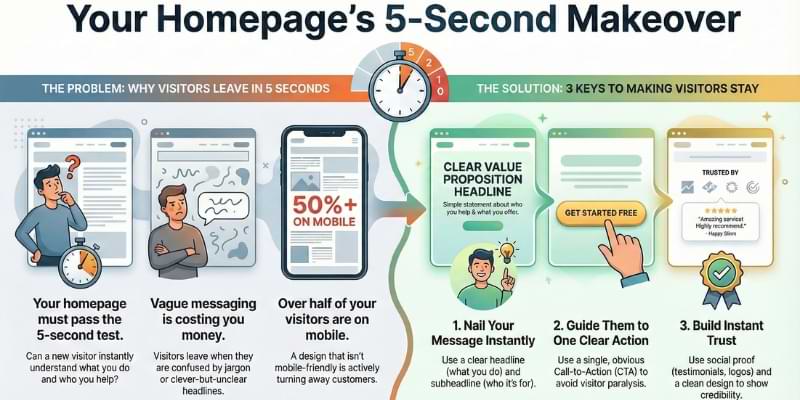
Here’s another uncomfortable truth: more than half your visitors are probably viewing your homepage on a phone. That beautiful, intricate design you spent weeks perfecting on your 27-inch monitor? It’s getting squeezed onto a 6-inch screen.
If your homepage doesn’t make sense on mobile, you’re losing customers before they even understand what you offer. This isn’t just about responsive website design anymore—it’s about mobile-first thinking from day one.
What Confusion Costs You
Every second of confusion costs you money.
When a visitor can’t immediately understand what you do, they bounce. When they can’t find what they’re looking for, they leave. When your call-to-action is buried under three paragraphs of corporate speak, they go to a competitor whose message is clearer.
The internet is an impatient place. Your homepage needs to respect that reality.
The Five Essential Elements of Website Design That Converts in Seconds
Alright, enough about what doesn’t work. Let’s talk about what does.
A homepage that passes the five-second test needs five essential elements. Not fifty. Not fifteen. Five. Each one serves a specific purpose, and together they create a clear path from “Who are you?” to “I’m interested.”
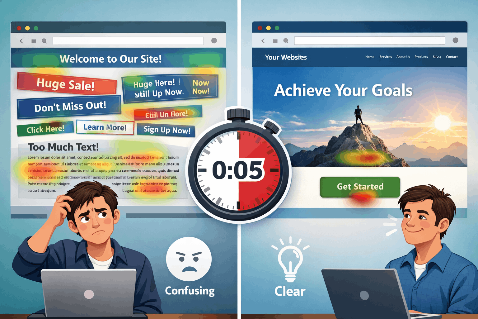
1. A Crystal-Clear Headline That States What You Do
This is your one shot. Your headline is the first thing people see, and it needs to answer the most basic question: “What does this business do?”
Not “Welcome to Our Website.” Not “Innovating Solutions for Tomorrow.” Not some clever wordplay that makes sense only to you.
Tell them what you do. In plain English.
Good headline: “We Help Solopreneurs Build Profitable Websites Without the Tech Headaches.”
Bad headline: “Empowering Digital Transformation Through Synergistic Solutions.”
See the difference? One is clear. One is garbage.
Your headline should be so obvious that a seventh-grader could understand it. That’s not dumbing down—that’s respecting your visitor’s time and attention.
2. A Supporting Subheadline That Clarifies Who It’s For
Your headline says what you do. Your subheadline says who it’s for and why they should care.
This is where you get specific. This is where you speak directly to your ideal customer’s pain point.
Example: “Perfect for busy business owners who want a professional online presence without learning code or hiring expensive developers.”
This does two things: it qualifies your audience (busy business owners) and it addresses their specific concern (no tech skills, limited budget).
If someone reads your headline and subheadline and thinks “That’s exactly what I need,” you’ve won. If they’re still confused, you’ve lost.
3. One Clear, Compelling Call-to-Action
Here’s where most homepages completely fall apart. They offer visitors 10 options and expect them to choose the “right” one.
Decision paralysis is real.
Your homepage should guide visitors toward one primary action. Not five. One.
Maybe it’s “Schedule a Free Consultation.” Maybe it’s “Download the Free Guide.” Maybe it’s “Start Your Free Trial.”
Whatever it is, make it obvious. Make it big. Make it impossible to miss.
And here’s the key: make it low-commitment. Most visitors aren’t ready to buy on their first visit. They’re just trying to figure out if you’re worth paying attention to. Give them an easy next step that builds trust.
Your call-to-action button should be a different color than the rest of your page. It should be above the fold (visible without scrolling). And the text should be action-oriented—start with a verb.
4. Social Proof That Builds Instant Credibility
Nobody wants to be the first customer. We all want to know that others have trusted you and had a positive experience.
That’s where social proof comes in.
This could be:
- Customer testimonials (with real names and photos)
- Logo badges of companies you’ve worked with
- Trust signals like “As Seen On” media mentions
- Numbers like “Trusted by 10,000+ Small Businesses”
- Star ratings or reviews
You don’t need all of these. Pick one or two that are most relevant to your audience and feature them prominently.
The goal is simple: reduce risk. When a visitor sees that other people like them have had success with your business, they’re more likely to take that next step.
5. Strategic Visual Hierarchy and White Space
This is the element most people overlook, but it’s absolutely critical.
Visual hierarchy means organizing your homepage so that the most important elements stand out. Your eye should naturally flow from headline to subheadline to call-to-action.
White space (or negative space) is the empty area around your content. It’s not wasted space—it’s breathing room. It helps your message stand out and makes your page easier to scan.
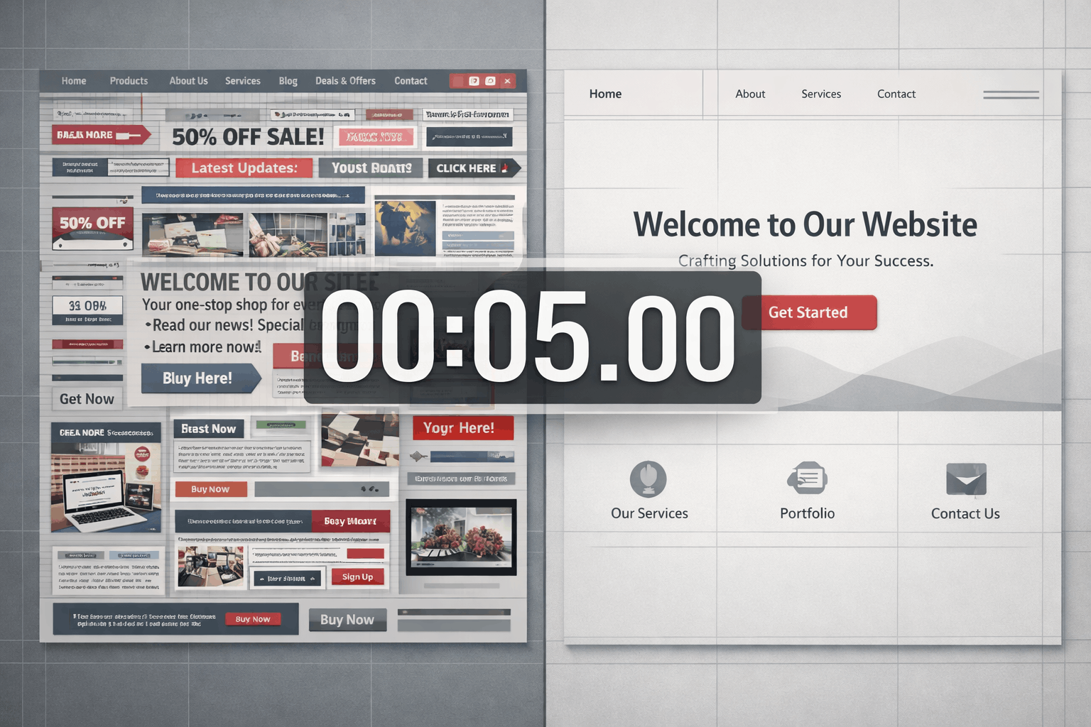
Too many homepages try to cram every possible piece of information above the fold. The result? Visual chaos. Nothing stands out because everything is competing for attention.
Instead, embrace simplicity. Use larger fonts. Add space between sections. Let your key message breathe.
Remember: your homepage isn’t a brochure. It’s a conversation starter. It doesn’t need to tell your entire story—it just needs to earn the visitor’s interest so they’ll stick around to learn more.
When you’re building your marketing strategy for small businesses, remember that your homepage is often the first touchpoint. Make it count.
Actionable Steps to Redesign Your Homepage (Without Starting From Scratch)
You don’t need to blow up your entire website to make these improvements. You can start making changes today that will have an immediate impact on how visitors perceive your business.
Here’s your roadmap to success.
Step 1: Run the Five-Second Test on Your Current Homepage
Before you change anything, you need to know where you stand.
Ask five people (not your mom, not your business partner—people who don’t know your business) to look at your homepage for five seconds. Then ask them:
- What does this business do?
- Who is it for?
- What should I do next?
Their answers will tell you everything you need to know. If they can’t answer these questions clearly, your homepage is failing the test.
You can also use tools like UsabilityHub to run formal five-second tests with real users. But honestly, just grabbing a few friends or colleagues works fine for this.
Step 2: Rewrite Your Headline and Subheadline
This is the highest-leverage change you can make.
Open a blank document and write down:
- What you do (in the simplest terms possible)
- Who it’s for (be specific)
- What problem you solve
Now craft a headline that communicates the first point and a subheadline that addresses the second and third.
Test it out loud. If it sounds like corporate jargon or marketing speak, start over. If it sounds like something you’d say to a friend over coffee, you’re on the right track.
Step 3: Simplify Your Navigation
Look at your main navigation menu. How many options are there? If it’s more than five or six, you’re overwhelming visitors.
Most small business homepages need:
- Home
- About
- Services (or Products)
- Blog (or Resources)
- Contact
That’s it. Everything else can go in your footer or be accessed through those main pages.
The goal of your navigation isn’t to show off everything you offer—it’s to help visitors find what they need without thinking too hard.
Step 4: Create One Dominant Call-to-Action
Pick the one action you want most visitors to take. Make it your primary CTA and feature it prominently.
Use a contrasting color for the button. Make it at least twice as big as any other button on the page. Put it above the fold.
And make sure the text is specific and action-oriented:
- ✅ “Download Your Free Marketing Checklist”
- ❌ “Click Here”
You can have secondary CTAs lower on the page for visitors who need more information, but your primary CTA should be impossible to miss.
If you’re working on your marketing plan, make sure your homepage CTA aligns with your overall customer acquisition strategy.
Step 5: Add or Improve Your Social Proof
If you don’t have testimonials, get them. Email your best customers and ask for a short quote about their experience working with you.
If you do have testimonials, make sure they’re:
- Specific (not just “Great service!”)
- Attributed (real names and photos build more trust)
- Relevant (focused on results, not just nice words)
Place your strongest testimonial near your main CTA. This reinforces the decision to take action right when the visitor is considering it.
Step 6: Audit Your Visual Hierarchy
Squint at your homepage. What stands out? Is it your headline? Your CTA? Or is it a random stock photo or a wall of text?
If the wrong elements are dominating, you need to adjust:
- Make your headline bigger (like, way bigger than you think it should be)
- Increase white space around key elements
- Use bold text strategically to highlight important phrases
- Break up long paragraphs into shorter, scannable chunks
Remember: people scan websites in an F-pattern (across the top, down the left side, then across again). Design your layout to work with this natural reading behavior, not against it.
Step 7: Test on Mobile (Right Now)
Pull up your homepage on your phone. How does it look? Can you read the headline without zooming? Is the CTA easy to tap? Does the page load quickly?
If anything feels clunky or slow, that’s a red flag. Your mobile experience should be just as clear and compelling as your desktop experience—maybe even more so.
Small daily wins add up. Making these changes might seem minor, but they compound over time as more visitors understand your message and take action.
Common Homepage Website Design Mistakes (And How to Fix Them)
Even with the best intentions, it’s easy to fall into common traps. Let’s address the mistakes I see most often with solopreneurs and small business owners.
Mistake #1: Trying to Appeal to Everyone
When you try to speak to everyone, you end up speaking to no one.
The fix: Get specific about who your ideal customer is. Use language they use. Address their specific pain points. If that means some people self-select out, that’s actually a good thing—it means the right people are self-selecting in.
Mistake #2: Hiding What You Do Behind Clever Copy
Clever headlines might win advertising awards, but they don’t convert visitors into customers.
The fix: Be boring if you have to be. Clarity always beats cleverness. Your visitors don’t want to solve a puzzle—they want to know if you can help them.
Mistake #3: Using Generic Stock Photos
That photo of a diverse group of people in business casual attire sitting around a conference table smiling at a laptop? Everyone has seen it a thousand times. It doesn’t build trust—it signals “generic website.”
The fix: Use real photos of you, your team, your workspace, or your actual customers (with permission). If you must use stock photos, choose ones that feel authentic and specific to your industry.
Mistake #4: Writing for Search Engines Instead of Humans
Yes, SEO matters. But keyword-stuffed copy that reads like a robot wrote it will drive visitors away faster than anything else.
The fix: Write for humans first, optimize for search engines second. Your homepage should sound like a real person talking to another real person. The best marketing strategies always prioritize human connection over algorithms.
Mistake #5: No Clear Next Step
Your visitor read your headline, they’re interested, and then… nothing. No clear direction on what to do next.
The fix: Always assume your visitor is asking “What should I do now?” Answer that question explicitly with a clear, visible call-to-action.
Mistake #6: Too Much Information Above the Fold
You’ve got five seconds. You don’t need to explain your entire business model, your company history, and your complete service offering before someone scrolls.
The fix: Focus on the essentials above the fold: headline, subheadline, CTA, and maybe one compelling image or piece of social proof. Everything else can go below the fold where interested visitors will find it.
Mistake #7: Ignoring Load Speed
A beautiful homepage that takes eight seconds to load is a homepage that most people will never see.
The fix: Optimize your images, minimize plugins, and use a quality hosting service. Every second of load time costs you visitors.
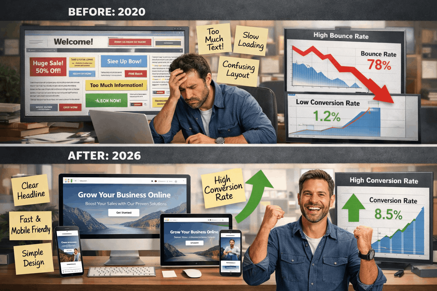
Real-World Examples: Before and After
Let’s look at how these principles work in practice.
Example 1: The Overwhelmed Consultant
Before: Homepage headline read “Transforming Organizations Through Strategic Consulting Excellence.” Navigation had 12 options. Three different CTAs competed for attention. Visitors had no idea what this consultant actually did.
After: New headline: “I Help Small Businesses Create Marketing Strategies That Actually Work.” Subheadline: “No fluff. No jargon. Just practical plans you can implement this week.” One CTA: “Schedule a Free 30-Minute Strategy Call.” Navigation simplified to five options.
Result: Bounce rate dropped by 40%. Consultation bookings increased by 65%.
Example 2: The Confused E-Commerce Store
Before: Homepage featured a rotating carousel of six different product categories. No clear value proposition. Generic “Shop Now” buttons everywhere. Visitors didn’t know what made this store different from Amazon.
After: Headline: “Handcrafted Home Goods Made by American Artisans.” Subheadline: “Every purchase supports independent makers and sustainable practices.” Featured one hero product with a clear “Shop the Collection” CTA. Added customer photos and reviews above the fold.
Result: Time on site increased by 55%. Add-to-cart rate improved by 38%.
Example 3: The Service Provider with Imposter Syndrome
Before: Buried the main service offering three paragraphs down. Used tentative language like “We try to help” and “We hope to provide.” No testimonials because “I don’t want to brag.”
After: Bold headline: “Website Design for Coaches Who Hate Technology.” Confident subheadline: “I’ll build you a professional site that attracts clients while you focus on what you do best.” Featured three specific client testimonials with results.
Result: Inquiry form submissions tripled. Client quality improved (fewer tire-kickers, more serious prospects).
The common thread? Each of these transformations focused on clarity, simplicity, and giving visitors a clear path forward. No fancy tricks. No expensive redesigns. Just strategic website design choices based on how people actually use websites.
Your Homepage is Your Digital Handshake
Here’s the thing about building your brand online: your homepage is often the first impression you make. And just like a handshake, you only get one shot at it.
A weak, confusing homepage is like a limp handshake. It doesn’t inspire confidence. It doesn’t make people want to do business with you.
A clear, compelling homepage is like a firm, confident handshake. It says “I know what I’m doing. I can help you. Let’s talk.”
You don’t need to be a design expert to create a homepage that works. You just need to understand what your visitors need in those critical first five seconds:
✅ Clarity about what you do
✅ Relevance to their specific problem
✅ Direction on what to do next
✅ Confidence that you’re credible and trustworthy
When you nail these four elements, your homepage becomes a powerful tool for professional growth and customer acquisition.
The best part? You can start making these changes today. You don’t need to wait for a complete website overhaul or a big budget. Pick one element from this article and improve it this week.
Maybe it’s rewriting your headline. Maybe it’s simplifying your navigation. Maybe it’s finally adding those testimonials you’ve been sitting on.
Small daily wins compound. One improvement this week. Another next week. Before you know it, you’ve got a homepage that actually works for your business instead of against it.
Remember: strategy meets psychology. Understanding how people make split-second decisions about websites isn’t just about design—it’s about human behavior. When you respect how your visitors think and what they need, you create a homepage that serves them and your business goals.
Take Action This Week
Don’t let this be another article you read and forget. Here are your actionable steps for the next seven days:
Monday: Run the five-second test with five people. Document what they say. This is your baseline.
Tuesday: Rewrite your headline and subheadline using the formulas in this article. Test them with the same five people.
Wednesday: Audit your navigation. Cut anything that isn’t essential. Simplify the labels.
Thursday: Create or improve your primary call-to-action. Make it bigger, clearer, and more specific.
Friday: Add or update your social proof. Get at least one strong testimonial if you don’t have any.
Weekend: Review your mobile experience. Make any necessary adjustments to ensure it’s as clear as your desktop version.
This is your personal development journey in action. Every improvement you make to your homepage is an investment in your business’s future. Every visitor who understands your message in five seconds is a potential customer you didn’t lose to confusion.
You’ve got this. Your homepage doesn’t need to be perfect—it just needs to be clear. Start there, and everything else will follow.
Now stop reading and start doing. Your next big opportunity is waiting on the other side of a homepage that actually explains what you do.
Learn proven website design strategies to create a homepage that explains your business instantly. Actionable tips for solopreneurs to boost conversions today. Share on X>>> Read more Weekend Workshop lessons here

Note: Some links on this page are affiliate links meaning that if you click on my link and make a purchase, I will receive a small commission. It does not however affect the price you pay. Plus, it’s a great way to support me and the content I’m providing.